POSTERS
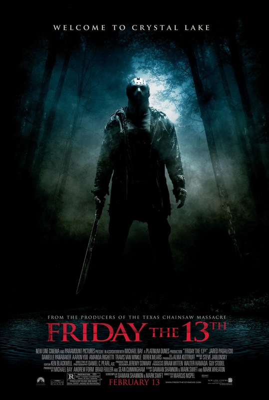
Film Title: Friday the 13th
Release Date: Friday the 13th 2009
Director: Marcus Nispel
Film Info: The film is a remake of the Friday the 13th series which began in 1980 and is the twelfth instalment in the franchise. The film was originally conceived as an origin story but the project evolved into a re-imagining of the first four Friday the 13th films.
Synopsis: Wade, Ritchie, Amanda, Mike and Whitney travel to Crystal Lake to camp but Wade and Ritchie have found a plantation of weed and intend to raise money selling it. However, the group is brutally attacked by Jason Voorhees. Six weeks later, Clay is seeking out his sister Whitney in Crystal Lake, distributing a missing poster with her around the local area. In a gas station, he stumbles into the arrogant Trent that has invited his friends Jenna, Lawrence, Chewie, Nolan, Chelsea and Bree to spend the weekend in the cottage of his wealthy family. Jenna teams up with Clay in his quest and they discover that Jason is killing her friends.
Production/Financing Company: Platinum Dunes – Crystal Lake Entertainment
Sub-genre: Slasher
Principle Cast: jared Padalecki – Clay Miller
Amanda Righetti – Whitney Miller
Danielle Panabaker – Jenna
Travis Van Winkle – Trent
Derek Mears – Jason Vorhees
Mise-en-scene
Lighting: The poster has low key lighting which helps to create tension and a ‘dark’ atmosphere and also helps to add mystery and uncertainty. The low key lighting signifies that the location, Crystal Lake is an isolated area which is a common convention of a horror movie/poster. The high key lighting towards the top of the poster is used to show the mask of the antagonist connoting that he has power over all and that he plays a significant part in the horrific event to come.
NVC: Jason’s NVC is hidden as he is wearing a hockey mask. The hockey masks fails to show his facial expression so leaves the viewers ‘on edge’ as they are unaware of his true emotions. He is also standing firmly on the ground which connotes that he is aware of the power he has.
Setting: The setting shown on the poster is the forest at Crystal Lake which is depicted as a dark and isolated place to be. The forest is filled with tall trees which seem to be surrounded by thick fog connoting that there will be a lot of isolation in the movie and helplessness.
Costume: He is wearing a torn brown jacket with a plain black shirt and trousers that are torn aswell. He is also wearing dirty work boots which connotes that he has been in Crystal Lake in the woods for a very long time and life has been tough for him hence why his clothes are torn. It also shows that his own well-being has not been taken into consideration by him. Jason is seen to be wearing a mask so his identity remain unrevealed. This helps to build tension as viewers may not know what he is capable of.
Props: Jason is seen to be carrying a machete which is what he uses to kill people in the movie. This prop is seen to be very threatening as it is quite a vicious item being used so builds fear in the viewers. His power being portrayed on the poster suggests that Jason is not afraid to use it on anyone.Camera
The poster is a wide shot of Jason in the woods. This is significant as we are able to see the antagonist in his ‘hunting environment’ where he kills the majority of his victims. The wide shot allows us to see how the environment he has inhabited has had a negative influence on him as it has affected his personality and attitude which is shown by his body language. The shot and the lighting make it seem like Jason is superior to everyone else when he is in the woods as his victims are unaware of what they are about to experience. Also, the poster seems to have Jason’s photo taken at a mid-low angle which connotes that he is above everyone else, giving him even more power.
Colour
the colours that are mainly being used are black and red. The black on the poster is used to signify the terror that the protagonists are experiencing and the dark fantasies that Jason is carrying out. The red that is being used for the text connotes that there will be a lot of blood being shed on that day. Also, the grey/camouflage colours on the poster make Jason blend in with the atmosphere which suggests that he can come out and attack at any time; when you least expect it as its hard for him to be seen.
Typography
The font used throughout this poster is ‘Serif’ which connotes a sense of tradition and history especially as this film is part of the Friday the 13th franchise that began 29 years beforehand. Text such as the release date and film title is in red which signifies death and aggression; suggesting that the characters and viewers should be terrified in advance.Mood & Styling
The lighting of the poster sets a very dark atmosphere which is very iconic in horror posters. It almost creates a depressing mood for the viewers as it imposes a sense of helplessness; allowing them to empathise with the characters in the film.
Specific Conventions
Majority of horror films have the antagonist with their weapon as the main image of the poster which gives the viewers an idea of what may happen in the film and who or what they should fear. The title of the film ‘Friday the 13th’ is written in a large red serif font in capitals to emphasize that specific day where several horrific events occur. It leaves the viewers wondering what exactly lies behind that day. The tag line says ‘welcome to crystal lake’ in a bold, white serif font which makes it clear to the viewers where Jason will be carrying out his massacres. “From the producers of the Texas Chainsaw Massacre” – this is a common convention of a horror movie poster as it helps to entice the viewers especially if the featured film being mentioned (Texas Chainsaw Massacre) scared the viewers and was given good ratings. As it was very popular film, the poster can be used to attract more customers, making the film more successful. The cast of the film and production companies are also included at the bottom of the poster so that viewers know who are involved in the making of the film. It is usually of a small font so that it doesn’t interfere with the main image.
No comments:
Post a Comment